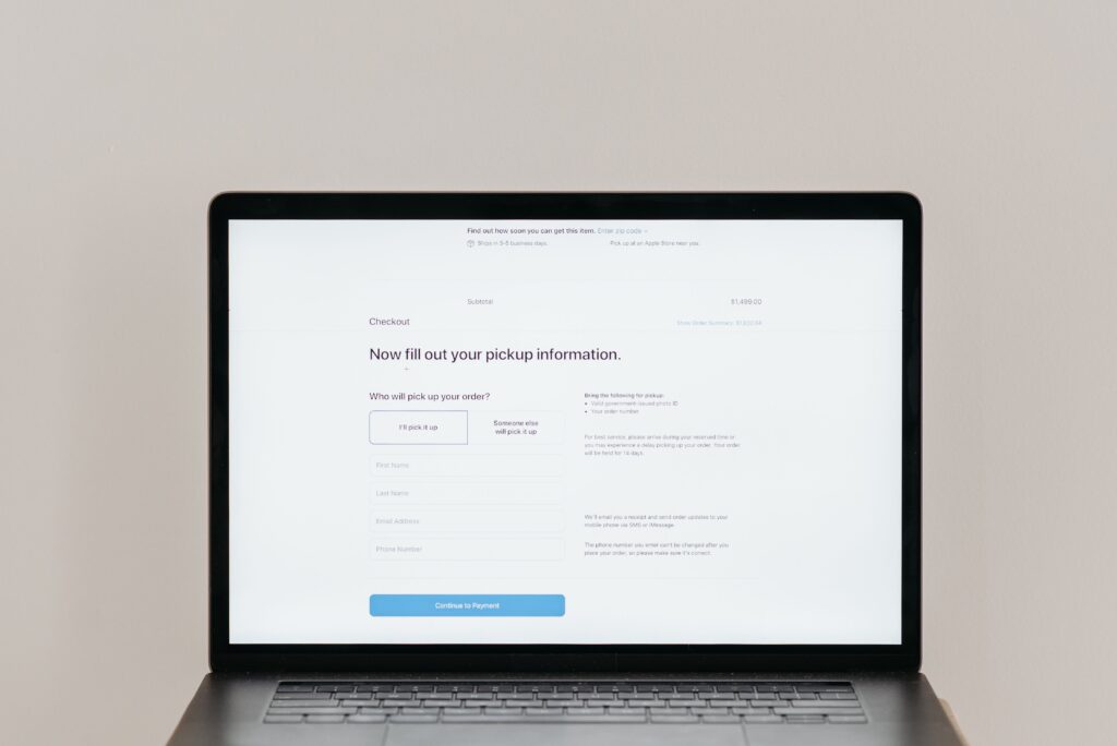
Most business owners who feel stuck online describe the same symptom. They say the phone is not ringing enough, the inbox is quiet, and the sales team has too little to work with. Their conclusion is almost always the same: we need more traffic.
Sometimes that is true. More often, it is not.
When you look at the analytics, the visitors are already there. People are finding the site through search, ads, social posts, and referrals. They land, they look around, and then they leave without calling, filling out a form, or asking a single question. That is not a traffic problem. That is a conversion problem, and it is far more common than most owners realize.
The frustrating part is that the causes are usually invisible from the inside. You know your business, so the site makes sense to you. A first time visitor has none of that context. They arrive with a question, a limited amount of patience, and several competitor tabs already open. If the page is slow, confusing, awkward on a phone, or simply does not feel trustworthy, they move on quietly. Nobody emails you to explain why they left.
This article walks through the issues that quietly reduce website conversions, and what you can do about each one without rebuilding your entire business online.
First Impressions Happen Faster Than You Think
People judge a website almost instantly. Research from Stanford’s Web Credibility Project found that the majority of users assess a company’s credibility based on the visual design of its site rather than its content. That judgment happens before anyone reads your carefully written service descriptions.
This is not about winning design awards. It is about looking like a business that is still operating, still investing in itself, and still worth trusting with money. A cluttered layout, mismatched fonts, stretched stock photography, and a logo that appears in three different colors across four pages all send the same signal: nobody is paying attention here. If nobody is paying attention to the website, a visitor reasonably wonders how much attention they will get as a customer.
Consistency does a lot of quiet work. When your colors, typography, imagery, and tone match across the homepage, service pages, and contact page, the site feels intentional, and an intentional site suggests a competent business. That impression buys you the extra thirty seconds you need to make your case.
A practical test: ask someone outside your industry to look at your homepage for five seconds, then close the laptop and describe what kind of company you are. If they hesitate, the problem is not your writing. It is what they saw before they read anything.
Slow Websites Cost More Than Rankings
Speed is the easiest conversion problem to ignore because you rarely experience it yourself. Your browser has your site cached. Your office internet is fast. Meanwhile, a prospect is loading your page on a phone with two bars of signal in a parking lot.
The numbers here are unusually clear. Google’s research with SOASTA found that as page load time increases from one second to three seconds, the probability that a visitor bounces rises sharply. Deloitte’s “Milliseconds Make Millions” study, commissioned by Google, went further and isolated speed as a variable across 37 brands and more than 30 million sessions. A mobile speed improvement of just 0.1 seconds was associated with an 8.4 percent increase in retail conversions and a 21.6 percent increase in progression through lead generation forms.
Read that again. A tenth of a second. Now consider what an eight or nine second homepage is costing you.
Website performance also affects search visibility, since speed and page experience are part of how Google evaluates pages. But the ranking impact is almost a footnote compared to the conversion impact. Even if you rank beautifully, a slow site simply hands your hard won visitors back to the search results page.
Common culprits are unglamorous: oversized images uploaded straight from a camera, a theme loaded with features you never use, a stack of tracking scripts nobody has audited in three years, and cheap hosting. None of these require a redesign to fix. They require someone to actually look.
Mobile Experience Can Make or Break Conversions
For most local and service businesses, mobile is now the majority of traffic. That means the mobile version of your site is not a scaled down copy of the real thing. It is the real thing.
Responsive design solved the basic problem of fitting content onto a small screen. It did not solve usability. Plenty of technically responsive sites are still miserable to use on a phone:
• Body text that requires pinching and zooming to read
• Navigation menus that hide the one page a visitor actually wants
• Buttons placed so close together that a thumb hits the wrong one
• Contact forms with ten fields, three of which demand information a prospect does not have handy
• Phone numbers displayed as images or plain text instead of a tappable link
Each of these is a small friction point. Individually, none of them feels fatal. Stacked together, they create a user experience that quietly filters out everyone except the most determined visitors, and the most determined visitors were probably going to contact you anyway.
Pick up your own phone and try to hire yourself. Find a service page, read it, and complete the contact form using only your thumb. Most owners discover at least two problems in under three minutes.
Visitors Should Immediately Understand What You Do
Vague messaging is the most expensive mistake on this list, and the hardest to see in your own copy.
A homepage that opens with a sentence about delivering innovative solutions for modern businesses tells a visitor nothing. It could describe a software company, an accounting firm, or a plumbing contractor. When people cannot quickly determine what you sell, who you serve, and why you are a reasonable choice, they do not stay to investigate. They go back and click the next result.
Strong website messaging answers four questions above the fold, in plain language:
• What do you actually offer?
• Who is it for?
• Why should someone choose you rather than the alternative?
• What should they do next?
“Commercial HVAC maintenance for restaurants and hotels across the Phoenix metro area, with same day emergency service” is not poetic. It is clear. Clarity converts. The instinct to sound impressive is what pushes so many businesses toward language that sounds important and communicates nothing.
Your differentiator does not need to be dramatic either. Faster response times, transparent pricing, specialization in one industry, or a genuine guarantee are all reasons to choose you. Just say them out loud on the page instead of assuming visitors will infer them.
Trust Signals Influence Every Buying Decision
Nobody hands over money or contact details to a business they are unsure about. Every prospect on your site is running a quiet background check, and your job is to make that check easy to pass.
Trust is built from small, specific proof:
• Testimonials that name a real person and describe a real outcome, not anonymous praise
• Reviews from platforms customers already use, such as Google
• Certifications, licenses, and industry accreditations relevant to your field
• Awards and recognitions, when they mean something to your audience
• Client logos, particularly recognizable ones
• Case studies showing the problem, the work, and the result
• A physical address, a real phone number, and a contact page that is easy to find
• HTTPS security, which is now an expectation rather than an advantage
The last one deserves a note. A browser warning that a site is not secure will end most visits immediately, and it is one of the cheapest problems in this entire article to fix.
Placement matters as much as presence. Trust signals buried on an “About Us” page do very little. Put proof where the decision happens: beside the pricing, next to the contact form, on the service page where the visitor is weighing whether to reach out.
Every Page Needs a Clear Call to Action
Visitors should never have to figure out what to do next. It is your job to tell them.
A surprising number of service pages end with nothing. The copy simply stops. The visitor has been convinced, has scrolled to the bottom, and is now confronted with a footer. They scroll back up, hunt for a contact link, and some meaningful percentage of them just close the tab instead.
Every page should end with an obvious next step, phrased in language that matches the visitor’s readiness:
• Request a quote
• Book a consultation
• Schedule a demo
• Contact us
One primary action per page is enough. When you offer four equally weighted buttons, you are asking a visitor to make a decision they did not come to make, and indecision usually resolves as inaction. Choose the action you most want and make it the most visible thing on the page. A secondary, lower commitment option, such as downloading a guide or checking pricing, can sit quietly beneath it for the people who are not ready yet.
Also, reduce what you ask for. Every additional form field is another reason to abandon. Name, email, phone, and a short message will get you a conversation. You can gather the rest during the conversation.
Small Improvements Often Produce Bigger Results Than More Traffic
Here is the pattern that plays out constantly. A business is unhappy with its lead volume, so it increases its ad budget and invests in SEO. Traffic goes up. Leads barely move. The conclusion is that digital marketing does not work for their business.
What actually happened is that they poured more water into a leaking bucket.
The math is worth seeing plainly. Take a site with 5,000 monthly visitors converting at 1 percent, and compare two ways of getting to 100 leads a month.
| Approach | Monthly visitors | Conversion rate | Monthly leads | Marketing spend |
| Today | 5,000 | 1% | 50 | Baseline |
| Buy more traffic | 10,000 | 1% | 100 | Roughly double |
| Fix the site first | 5,000 | 2% | 100 | Roughly flat |
Both paths land on the same number of leads. Only one of them keeps costing you more every single month. That is the entire argument for conversion rate optimization, and it is why CRO tends to be the smartest first investment rather than the last one.
Conversion rate optimization is not guesswork. It is a cycle: look at where visitors are dropping off, form a hypothesis about why, change one thing, and measure what happens. Sometimes the winning change is a rewritten headline. Sometimes it is removing three fields from a form. Baymard Institute’s ongoing research into checkout usability has consistently found that a large share of online purchases are abandoned before completion, much of it caused by friction that has nothing to do with price or product.
The same principle applies to service businesses. A prospect who abandoned your contact form was interested enough to start filling it out. Understanding why they stopped is worth more than another thousand visitors.
The compounding benefit is that every improvement to website conversions makes every future marketing dollar more efficient. Better website optimization lowers your cost per lead across ads, organic search, email, and referrals simultaneously.
For businesses that want a comprehensive evaluation rather than a series of guesses, working with an experienced digital marketing agency can help identify the specific issues limiting conversions and prioritize the fixes that will actually move revenue.
The Takeaway
A website has one job, and it is not to attract visitors. It is to turn them into leads, inquiries, and customers. Traffic is only the raw material.
The barriers described here are rarely dramatic. They are a header image that takes six seconds to load, a form that is annoying to complete on a phone, a headline that sounds impressive but says nothing, a missing testimonial, an absent button. Individually, each one costs you a small number of prospects. Together, they can quietly cost you most of them.
Set a reminder to review your site properly twice a year. Load it on a phone using cellular data. Ask someone unfamiliar with your business to find your pricing and contact you. Look at where people are leaving. Fix what you find, then measure.
The customers you are losing today were already interested enough to visit. That is the hardest part of lead generation, and you have already paid for it. What remains is making sure your website does not get in their way.