In 2026, “good web design” will no longer be judged mainly by how pretty a page looks on a designer’s monitor. It’s judged by how quickly a visitor feels oriented, how confidently they can take the next step, and how consistently the site adapts to real human needs—attention spans, accessibility, privacy expectations, and the fact that people now arrive with AI-shaped habits.
At Joi AI, the brand voice is unapologetically direct, and the product promise is built around rejection-free connection, openness, creativity, and ethical integrity. Those values translate naturally into a 2026 design philosophy: be bold, be clear, be fast, and don’t make users fight the interface to get what they came for.
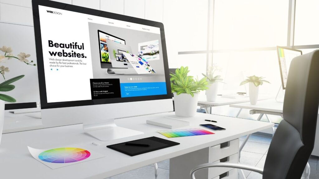
Below are the web design trends we see defining 2026—plus how to apply them in a way that feels modern without becoming “trend soup.”
1) AI-assisted design becomes normal (and more useful than “auto-generate a layout”)
The most practical shift in 2026 is that AI is moving from “generate something” to “improve what exists.” Designers increasingly use AI to tighten typography, propose palette adjustments, surface accessibility issues, and optimize layout decisions based on real behavior data—less hype, more craft. Elementor’s 2026 trend forecast describes AI’s role evolving into a design assistant that can suggest accessibility improvements, refine typography and color palettes, and support layout optimization.
How to use it well:
- Let AI handle variation (headlines, component spacing options, CTA phrasing alternatives).
- Keep humans in charge of taste, tone, and ethics.
- Use AI as a “second set of eyes,” especially for consistency and accessibility.
2) Accessibility stops being a compliance project and becomes a conversion advantage
Accessibility in 2026 is no longer a niche concern. WCAG 2.2 extends WCAG 2.1 with additional success criteria, and W3C explicitly recommends adopting WCAG 2.2 as the conformance target. The result is a broader expectation that modern sites will work for keyboard users, screen readers, low-vision users, and users with cognitive or motor constraints—without requiring a separate “accessible version.”
The accessibility tooling ecosystem is also accelerating. For example, TechRadar recently highlighted how site builders are rolling out easier, browser-based accessibility scanning and remediation workflows to reduce friction for teams that lack in-house expertise.
2026 design signals of accessibility maturity:
- Strong focus states (not subtle, not hidden).
- Real contrast (especially for secondary text).
- Motion controls (reduce motion toggles that actually work).
- Clear error handling (forms that explain what went wrong in plain language).
3) Performance-first design becomes the aesthetic
The fastest sites “feel” more premium—because they respect time. 2026 design language increasingly treats speed as part of the brand, not an engineering footnote. Trend roundups focused on 2026 consistently emphasize performance-first experiences alongside bold visuals.
What this looks like in practice:
- Fewer heavy hero videos by default; more smart poster frames and “play on intent.”
- Variable fonts and restrained font loading.
- Component-based pages that reuse assets instead of re-downloading them.
- Motion used with intention, not as a permanent tax on load time.
If you want a site to feel modern in 2026, make it quick. Then make it beautiful.
4) Expressive typography returns—because people are tired of “perfect AI blandness”
After years of clean, samey sans-serif minimalism, 2026 is swinging back toward typography with personality: warmth, storytelling, and even deliberate imperfection. Creative Bloq’s typography trend reporting for 2026 points to expressive type, kinetic typography, variable fonts, and “deliberate friction” (texture, grain, quirks) as a counterbalance to overly polished, AI-smoothed design.
How to apply this trend without wrecking UX:
- Keep body text extremely readable; put personality in headings and display treatments.
- Use kinetic typography sparingly (one moment per page is often enough).
- Let type carry the brand voice—especially if your product is conversation-based.
For Joi AI-style experiences, type is part of trust: it signals whether the space is playful, safe, premium, or chaotic within two seconds.
5) The “anti-AI craft” look: texture, warmth, and tactile rebellion
The web is reacting to the flood of glossy, synthetic visuals with a renewed appetite for the human hand—texture, collage energy, and imperfect warmth. Creative Bloq describes 2026 graphic design trends as a move toward tactile, human-centric creativity and “anti-AI crafting,” even as AI tools ironically imitate traditional craft techniques.
Web translation of this trend:
- Soft grain overlays (subtle, not heavy).
- Hand-drawn accents used like seasoning, not the whole meal.
- “Real” photography and imperfect moments over sterile stock perfection.
- Warmer palettes and more emotional color choices.
This trend pairs especially well with brands centered on emotion and identity, because it makes the interface feel less transactional.
6) Bento grids evolve into “curated dashboards”
Bento-style grids (modular, card-driven layouts) have been trending, but in 2026 they become more editorial: less “app tiles,” more “curated exhibits.” The best bento implementations feel like walking through a gallery—each card has a purpose, a hierarchy, and a strong visual hook.
How to do bento grids right:
- Give each card a single job (don’t cram).
- Use varied card sizes to create rhythm and hierarchy.
- Make cards interactive only when it helps (hover effects with meaning, not decoration).
For AI products, bento grids are a natural fit: characters, chats, features, safety rules, and onboarding steps all map cleanly to modular layouts.
7) Conversational UX becomes a first-class design pattern
As AI products normalize, users increasingly expect a site to talk back: guided flows, interactive onboarding, and chat-driven discovery. Trend forecasts for 2026 frequently call out adaptive chatbots and conversational experiences as a mainstream website feature, not a novelty.
The 2026 best practice:
- Don’t slap a chat bubble on every page.
- Use conversational UI where it reduces friction: onboarding, product matching, FAQs, account help.
- Make the user feel in control (clear exit, clear privacy language, clear boundaries).
This aligns strongly with Joi AI’s “zero judgment / zero pressure” positioning—conversation should feel like an invitation, not a trap.
8) Trust design is the new “premium”
In categories involving intimacy, identity, or emotional interaction, design has to earn trust quickly. In 2026, trust design shows up as:
- Visible safety and consent cues (not buried).
- Transparent privacy language (plain English summaries).
- Clear expectations (“what happens next” everywhere).
- Reduced dark patterns (fewer manipulative popups, fewer guilt CTAs).
Joi AI explicitly foregrounds ethics, privacy, and consent as values. Modern web design in this space must reflect that in structure—not just in footers.
9) Micro-interactions become quieter, smarter, and more “human”
The era of noisy UI animation is fading. In 2026, micro-interactions are still everywhere, but they’re calmer: subtle feedback that guides rather than entertains. The goal is to make the interface feel responsive and alive without turning the page into a theme park.
Examples that work:
- A button that confirms action with a small, quick state change.
- A form that validates in-line with helpful language.
- A character card that reveals one extra detail on hover—just enough to invite a click.
The Joi AI takeaway: build for emotion, speed, and consent
If we compress 2026 web design into a single sentence, it’s this: make it feel human, make it fast, and make it trustworthy. The most successful sites will combine AI-assisted iteration, accessibility-by-default, expressive typography, warmer visuals, and conversational flows—while keeping control in the user’s hands.