
If your website design isn’t optimized for mobile users in 2026, you’ll be missing out on a huge opportunity to earn more revenue and reach and convert more people.
If you work in e-Commerce web development, placing mobile users at the centre isn’t optional anymore. It’s survival.
In this article, we’ll explain why mobile-first matters right now, show you the numbers, and give you some practical tips you can use today to make your store faster, easier to buy from, and more profitable.
Some Quick Stats (So You Don’t Have To Dig)
There are around 5.78 billion unique mobile users in the world today (about 70.1% of the global population). Smartphones account for around 86.9% of the mobile phone handsets in use, and 83.7% of all cellular mobile connections.
Mobile devices account for over 64% of global web traffic, which means that the majority of browsing is happening on phones. And around 96.3% of internet users access the internet by using a mobile phone (of some kind).
People are on their phones constantly, and they’re shopping. If your checkout flow, product pages, or search are created for desktops, you’re asking most of your visitors to do extra work, and they simply won’t do it.
You’re missing out on a huge audience and leaving a bad impression on visitors.
Why Mobile-First is More Than Just “Shrunken Desktop”
The approach for mobile-first does not mean making the desktop version smaller. It’s a different mindset and a process:
- Prioritize the tasks people do on phones. On mobile, users scroll, tap, and want their requests to be fulfilled immediately. This means they want quick discovery of your product, frictionless checkout, and clear calls-to-action (not 10 options and a long form).
- Design for constraints, then scale up. Start with a small canvas and decide what content and actions are needed. Then just add enhancements for larger screens.
- Performance is a conversion lever. Mobile networks are different; slow pages mean that your carts will be abandoned. Mobile-first forces you to optimize images, scripts, and server responses, so that the pages can load as quickly as possible. This will boost your conversions and keep visitors interested in your brand.
- Different context, different UX: You have to think about where people will be while they’re checking out your store. We browse on our phones at random times of the day.
On the bus, people browse; in-store, they compare prices; and during a quick lunch break, they buy. Mobile UX should respect interruptions, limited attention span (which we all have by now), and touch interactions.

The Business Case: Conversions, Retention, and Reach
Mobile users aren’t just browsing. Many of them are buying. Recent industry measures put mobile commerce, or m-commerce, at a majority share of e-commerce sales.
That means improving your mobile experience has a direct impact on your revenue:
- Faster, easier mobile checkouts reduce cart abandonment.
- App-like experiences like PWA and saved payment methods increase repeat purchases.
- Mobile-friendly content ranks better in mobile search and in social feeds, boosting discovery.
Simply put, invest in mobile UX, and you’re investing in the channel where most people spend their time and buy.
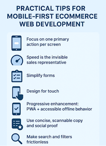
Practical Tips for Mobile-First eCommerce Web Development
Here are actionable things you can implement or ask your developer/designer for.
Focus On One Primary Action Per Screen
On a product page, the main goal is to buy. Make the Add to Cart / Buy Now button visible without scrolling. Reduce competing links. Fewer choices = faster decisions that benefit you.
Speed Is The Invisible Sales Representative
Target <2.5s Largest Contentful Paint (LCP) on mobile. Optimize images (serve responsive WebP/AVIF), lazy-load below-the-fold content, and load the important things first. Use a CDN and consider server-side rendering for key pages.
Simplify Forms – Let The Phone Do The Heavy Lifting
Use native input types for telephone and email and enable autofill for name/address/payment. Offer one-tap wallets like Apple Pay/Google Pay. They cut the checkout time and errors dramatically.
Design For Touch
Place primary actions within thumb reach (lower part of the screen), make tappable targets ≥44px, and avoid hover-dependent interactions. Tiny links and crowded UIs are mobile conversion killers.
Progressive Enhancement: PWA + Accessible Offline Behavior
Progressive Web Apps give app-like speed and can add home-screen shortcuts, push notifications, and smoother repeat visits, without forcing users to download an app. They’re great for retention.
Use Concise, Scannable Copy And Social Proof
People skim on their phones, so the first thing they see is always important and should grab their attention. Lead with benefit-driven headlines, short bullet points, and one strong testimonial or trust badge near the CTA. Take out any long paragraphs unless the user requests details.
Make Search And Filters Frictionless
Implement fast, typo-tolerant search with intelligent suggestions and a minimal set of high-impact filters (price, size, availability). Hidden advanced filters are fine for mobile. Surface the essentials first.
Testing With Real Devices And Network Simulations
Don’t just rely on desktop emulators. Actually test on low-end devices, slow networks, and different screen sizes. Real-world testing finds all the small annoyances that kill conversions.
A Few UX Copy Tricks That Work On Mobile
- Replace “Submit” with action verbs like “Buy now,” “Save 20%,” or “Get my code.”
- Use inline microcopy for forms. For example, “We’ll never share your email”. A little reassurance can reduce friction.
- Use progress indicators for multi-step checkouts (“Step 2 of 3”) so users know how much is left.
Common Mobile Mistakes to Avoid
Here are some mistakes people make:
- Overcrowding the header with too many CTAs. Keep it clean and simple.
- Using oversized desktop images that slow down page loads.
- Hiding critical info like shipping and returns in tiny accordions.
- Relying on “Add to Cart” alone, without providing any guest checkout path or express pay options.
Ready to Win Over the Mobile Crowd?
Mobile-first design continues to evolve: more users, faster wallets, social commerce integrations, and new form factors-foldables. The competition is brutal, and stores are doing everything they can to stay ahead.
Adapting to this change means staying in the game.
You just have to understand the basic principles and build from there (fast pages, thumb-friendly layouts, simplified checkout, and copy guiding micro-decisions).
The prize for getting mobile right in 2026 is very clear: hit where the people are, reduce friction, and grow your revenue. Miss it, and you’re losing the majority of potential customers. Your call.