In April, a study in the Science Advances journal reported the discovery of a new color. It’s called “olo” and looks like a shade of greenish-blue. Humans can’t see it without the stimulating effects of a laser, meaning that it’s unlikely to crop up on a takeout menu anytime soon.
Color is a dynamic thing in science and everyday life, and its use is ever-changing. Yet, after brands like McDonald’s decided to ditch the reds and yellows for greys, its value might seem diminished. Do we still care about color?
“Beigeification”
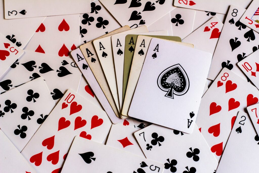
Businesses tend to adhere rigidly to certain color trends. Creative and entertainment-based industries, however, typically have more freedom. The real slots online at Paddy Power, for instance, use a full spectrum of colors to entice different demographics. The purple and gold in Mask of Amun Gold Blitz Ultimate will appeal to fans of the extravagant, yet often eerie Ancient Egyptian aesthetic, while Lucky Granny draws from the neon tones of Vegas for its theme. This is all going on while the site itself, at its core, maintains a green and orange color palette to anchor the various offerings to a single brand.
Just as in marketing manuals, there’s a list of what each color conveys in wider entertainment. “Orange” films are energetic – citrussy, if you like – while black and white can suggest something deeply simple but critical to a story’s tone – “no” and “yes”, respectively, or disapproval and acceptance.
It’s easy to transfer these different associations with color to marketing and company branding. Many of the colors mean the same to customers as they do to film audiences. However, businesses took a turn for the beige after the 2000s. There are even words for what McDonald’s did to its restaurants – “blanding” or “beigeification”.
So, if one of the biggest brands in the world seemingly doesn’t care about color anymore, why should anybody else?
Brand Recognition
There are a few more terms associated with this trend, like “minimalist”, “elegant”, “clean”, and “harmony,” but the reasons for it aren’t quite as easily defined. A study quoted by CreativeBloq noted that humans may simply be evolving away from color. Research on photos in the UK Science Museum showed a decreasing lack of hues over time.
Oddly, the science itself hasn’t changed. Most people – 80-85%, according to branding company Phable – are heavily influenced by color in brand recognition and in making purchasing decisions, which raises the question of how the removal of color helps anybody. Our brains see color before words and pictures, so the “blanding” makes us work harder to recognise products, albeit not in any way we’d notice.
Discussing how car colors have faded, too, UX Magazine suggests that society is increasingly being made uniform, with local quirks sacrificed for “efficiency, calculability, predictability, and control”. It’s a dystopian way of thinking, attributed to George Ritzer, the author of a book dedicated to “McDonaldization”, but the idea of color as an accessory rather than something truly essential isn’t too difficult to grasp.
Color still matters – and perhaps even more so in a world that’s turning it into a rarity. The fear of color in branding might just be another fad, although it’s hard to say if the world of commerce will ever again be as colorful as it used to be.