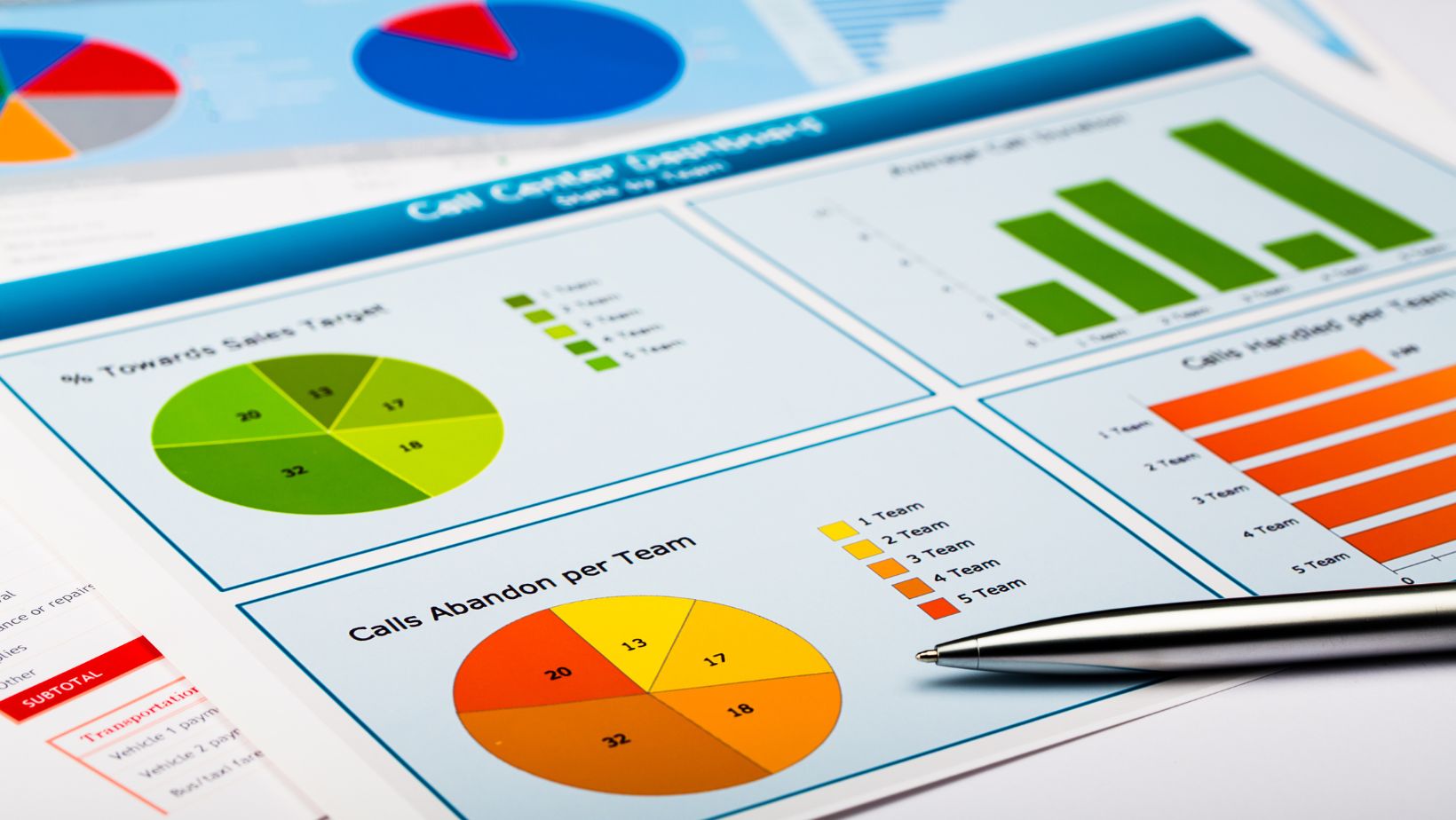
The way we understand information is changing. In today’s world, raw data is everywhere—but it’s not always easy to digest. Charts, graphs, and dashboards are more than just visual elements; they’re powerful tools that help people make decisions faster and smarter. With so much information coming in from every direction, organizations are looking for ways to turn complexity into clarity. When visuals are used effectively, they reveal patterns, highlight opportunities, and inspire action. From finance and healthcare to education and product development, every industry is tapping into the potential of clear, compelling data design. This is where visual storytelling begins to transform how people work, lead, and innovate. Keep reading to explore how different formats bring numbers to life—and see how they’re making an impact in the real world.
Clarity Over Complexity
The best data visuals don’t just display information—they simplify it. Whether you’re creating a dashboard for executives or a report for stakeholders, your goal is to remove barriers to understanding. A well-crafted chart distills thousands of data points into a format that’s both easy to read and quick to interpret.
Color, contrast, and layout play a big role in that clarity. Visual hierarchy guides the eye toward what matters most, while consistent formatting reduces cognitive load. Clean design not only makes data accessible—it makes it actionable.
Simplicity also means choosing the right format for the story you’re trying to tell. Bar charts, for instance, are great for comparisons. Line charts show trends. Pie charts highlight proportions, while heat maps are ideal for volume and intensity.
Annotation tools can also enhance understanding. When key data points are labeled or contextual insights are added beside a graph, readers gain clarity faster. Combining visuals with brief narratives encourages comprehension and deeper engagement with the information.
When done correctly, visualization removes ambiguity and builds confidence. Instead of searching for insights, users see them immediately and can make decisions faster.
Visuals That Empower Teams
Across departments, data is essential to collaboration. Marketing uses it to track campaign performance. Product teams rely on it for feature adoption. HR looks at workforce trends, and finance monitors revenue flow. But these insights are only helpful if they can be shared and understood by everyone involved.

That’s where universal design matters. A good visual speaks the same language to everyone, whether they’re analysts, strategists, or executives. With intuitive dashboards and visuals, cross-functional teams align more easily and act more decisively.
Collaborative platforms also allow teams to filter views, zoom in on metrics, or customize reporting in real time. This interactivity increases engagement and keeps everyone focused on what matters.
For distributed or remote teams, dashboards become a shared touchpoint. Whether accessed from a laptop in a coworking space or a phone on the go, data visualization ensures decisions aren’t delayed by location or time zone.
The result is not just shared knowledge, but shared momentum. When teams work from the same visual data source, silos break down and strategies accelerate.
Finding the Right Format for the Message
Not all data tells the same story, and not all visuals suit every dataset. One of the most overlooked parts of effective design is choosing the format that matches the insight.
Temporal data, like website traffic over time, often works best with line graphs. Geographic data calls for maps. Ranking or frequency comparisons are easier to digest in horizontal bar charts.
And when communicating uncertainty or variability, error bars and box plots offer clarity.
Interactive visualizations, such as sliders or dynamic drill-downs, can also uncover insights hidden beneath the surface. They help users explore “what-if” scenarios or test assumptions in real time.
Dashboards that combine multiple formats—charts, filters, gauges—enable broader understanding across layers of information. A single visual might answer a question, but a dashboard tells a whole story with built-in flexibility for discovery.
The key is alignment between data type, audience, and visual strategy. A simple format might win over a high-level audience, while a detailed one may be necessary for technical users. What matters most is that the visualization leads to understanding—fast.
Elevating Experiences Through Design
Design isn’t just aesthetics—it’s how people experience data. Great design choices help users engage with information, absorb it quickly, and recall it later. From color theory and typography to spacing and motion, design principles enhance both form and function.
For example, using contrasting colors can draw attention to high-priority metrics or outliers. A consistent color palette across dashboards promotes familiarity and reduces confusion. Label placement, axis scaling, and whitespace all influence how easily someone can follow a visual’s logic.

Accessibility is another major design component. Colorblind-friendly palettes, readable fonts, and descriptive text ensure visuals work for every viewer, not just a select few.
Motion graphics and animations can also improve storytelling when used sparingly. A visual that transitions from one timeframe to the next can reveal progress, fluctuation, or risk. Movement can also be used to emphasize change or progression without overwhelming the viewer.
When visuals are well-designed, users don’t just see data—they feel empowered by it. Thoughtful presentation makes insight easier to find and decisions easier to make.
Making Insight Repeatable and Scalable
Visual storytelling shouldn’t end with a single report or dashboard. The most successful teams build systems that allow them to scale insights across projects, departments, and regions.
Templates, branded styles, and consistent naming conventions make it easier to replicate visuals with high quality and minimal effort. This not only saves time—it builds trust. When stakeholders recognize a format, they know what to expect and how to read it.
Automation also plays a role in repeatability. By linking live data sources to visuals, updates happen automatically—no need to rebuild dashboards from scratch. This ensures reports stay current and reliable without the need for manual upkeep.
Repeatable visuals also support transparency. Leadership can monitor performance with confidence, while teams can track KPIs in real time. A scalable visual system is more than efficient—it’s foundational to a culture of data-driven thinking.
Training and documentation also make visualization systems scalable. When team members understand how to create or modify visuals using set standards, consistency spreads naturally across the organization.
And if you’re searching for visual inspiration, you can find some of the ideal examples for data visualization here, which showcase how design, storytelling, and technology come together to create clarity from complexity.


